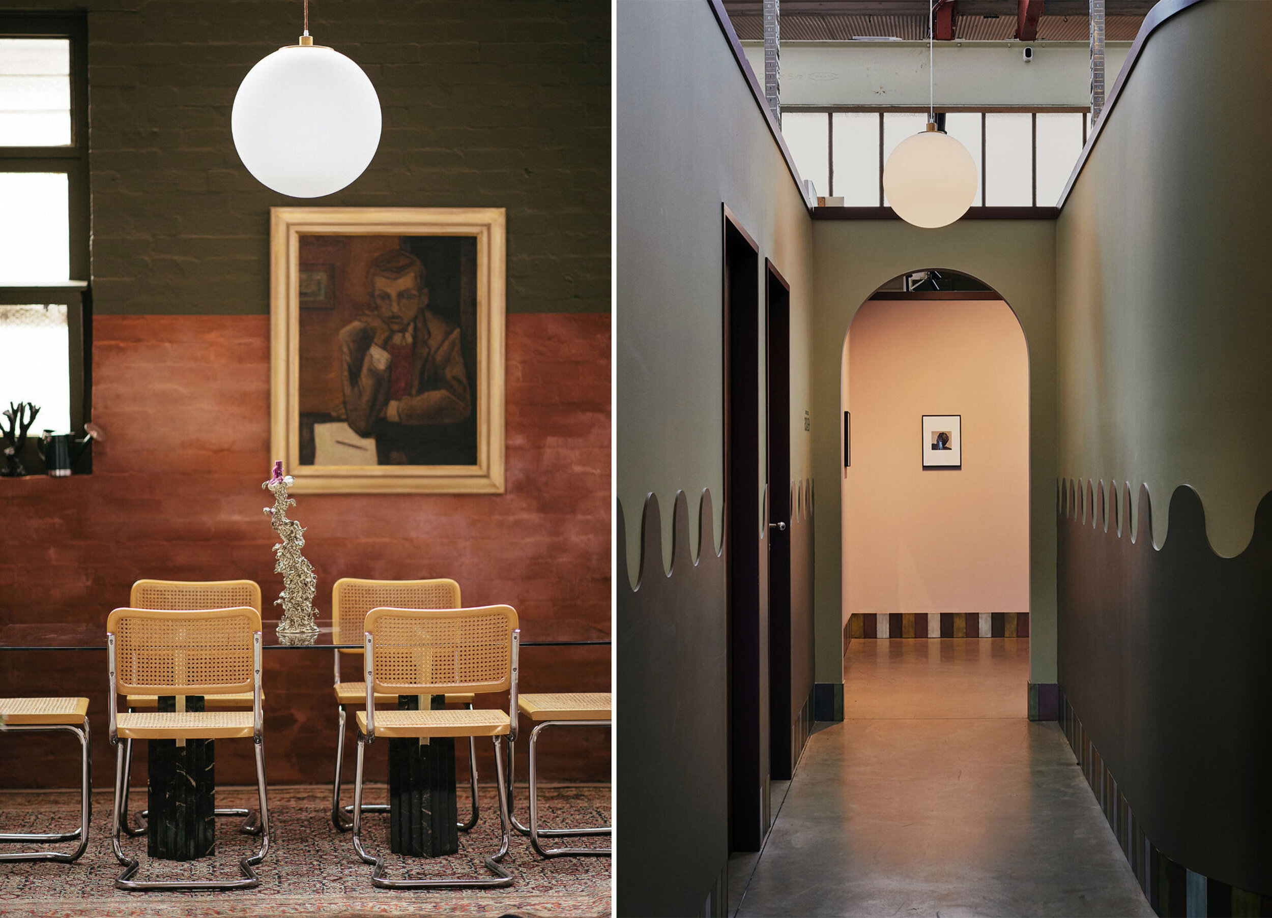
Le Space
Identity
Print
Environmental
—
Arts
Le Space is a multidisciplinary hub for creation and exhibition, exploring the intersectionality between art, design, commerce and education.
Our aim was to create an identity which attempts to communicate tension and a juxtaposition of ideas — classic vs avant garde, aspirational vs attainable, unique vs approachable.
I opted for a multi width font to construct the main identity. By creating a rule based system, we would swap out the vowels in the condensed typeface for it's wide alternates to get an arrangement of letters which is unique yet subtle in its execution. A subtle nod to the juxtaposition of ideas through the marriage of condensed and extended type — reinforcing notions of tension.
The use of a white block-out background would allow for a more practical and assertive placement over imagery, contrasting the tone of a typically exclusive and seemingly unattainable art/collectors market.
Initial deliverables included gallery posters, certificate of authenticity and gallery sheet. This is an ongoing project with business stationery, website and other digital materials to follow.